ADVERTISEMENTS

The Victorian era’s capitalism relied heavily on advertising. Advertisements were commonly found in the newspapers and magazines but were also found in other forms such as leaflets, posters, handbills and trade-cards.
This constant use of advertisements mainly targeted the middle-class consumers and promoted the transition from local, artisanal work to the larger industrially produced products, whether it be the next new bustle or corset, stationery item or to stationary and homeware.
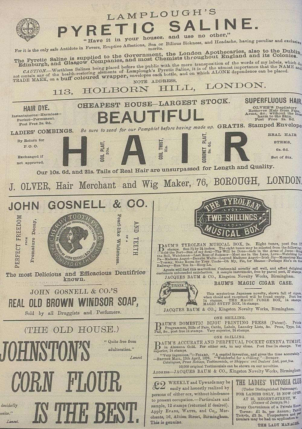
Advertisements were well designed and eye-catching but also provided all the essential information. The textual and paratextual information would fuse into one, being an effective way of marketing products to consumers.

Advertisements across the era
1877 - The Ladies’ Gazette of Fashion
The advertisements within this periodical are examples of how large and varied fonts combine with images to get the message across.
The logos in these adverts have a similar typography but the designs represent the product well and advertise the products through the logo alone. But together with the text, they provide all the information the consumer could need.

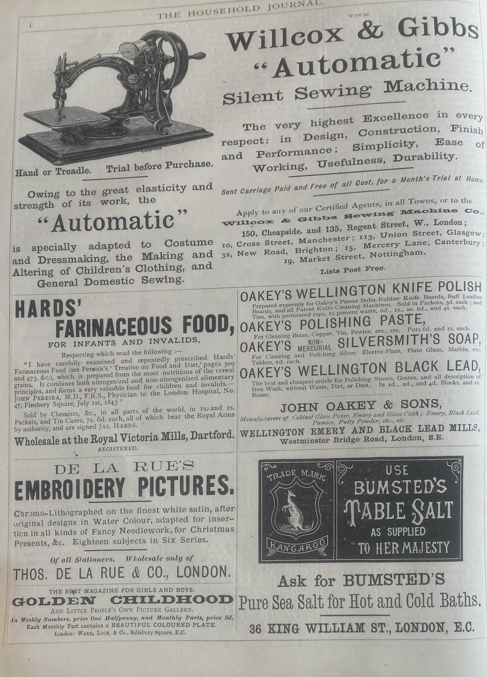
1880 - The Illustrated Household Journal
The advertisements in this periodical have illustrations and a larger range of typographic designs, making each advert in itself engaging. The readers of this periodical were typically middle-class and were mainly women that were looking for guidance on domestic management, fashion and social etiquette. The adverts reflect this and show that the periodical knew their audience and what products their readers would have been attracted to.
The sewing machine advert firstly presents the growth in products and machinery from the industrial revolution and, secondly, shows typical marketing techniques. It focused on what would attract the reader-consumer, a woman.
The advert about salt, while having less room on the page compared to the sewing machine advert, still is effective. It gets all the key information across in little words and includes the company logo, making it known to the consumer so when she sees this in shops, she will be inclined to buy this product over others.
1885 - The Ladies’ Gazette of Fashion
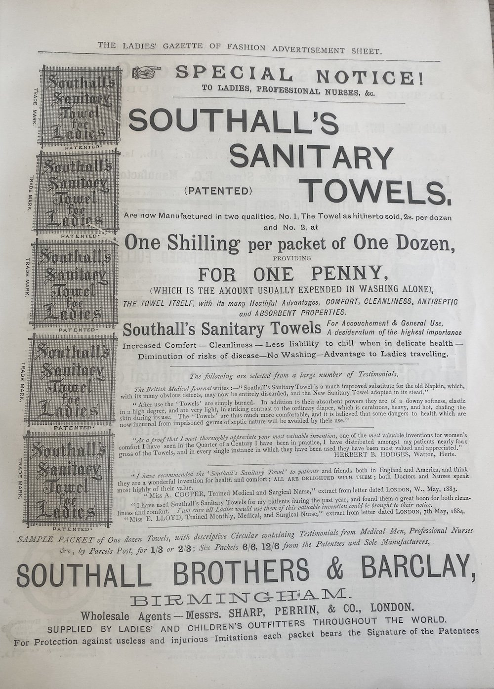
The typical consumers of this magazine were middle- to upper- class young ladies and women. This is shown through the content of the periodical as well as the adverts provided, such as the sanitary towel advert. This advert had a whole page within the magazine and provides the prices of the sanitary towels as well as testimonials recommending the product. These testimonials are from medical men and professional nurses, which is a further marketing technique but also shows that female products were created by men for women, but are also medical people providing professional reassurance.
The sewing machine advert is the same as that featured in the previous periodical five years prior, which shows that the ad works across multiple women’s magazines. The marketing techniques have not changed so one can assume that it was successful in encouraging sales of the product.
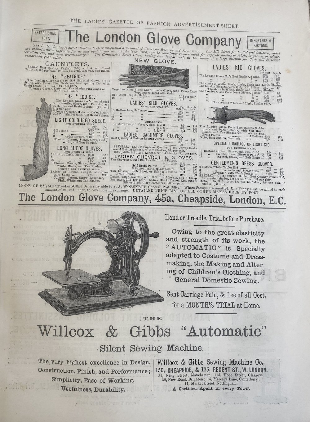
The glove advert on this page also looks as if it is a catalogue or shop, advertising all of their products. This was a common way of advertising in magazines at this time, which differs to now as magazines mainly just market their brand or a single product instead of all products available. It can also be seen in some of the adverts that the monarchy was used to further market products in an age when the monarchy was looked up to.
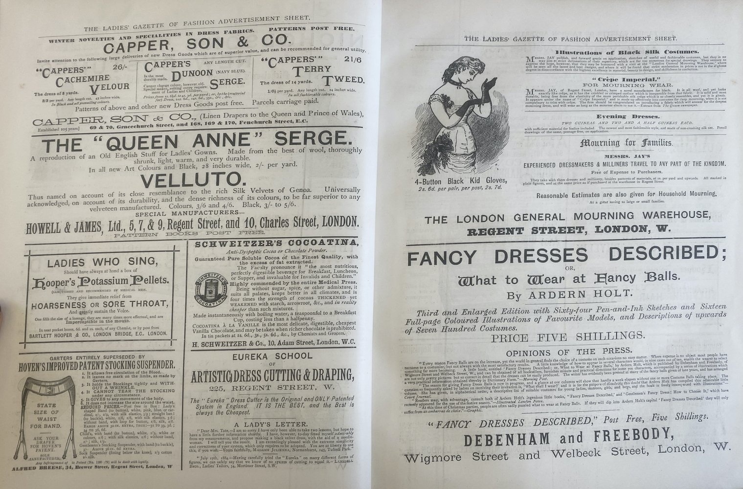
1890 - The Ladies’ Gazette of Fashion
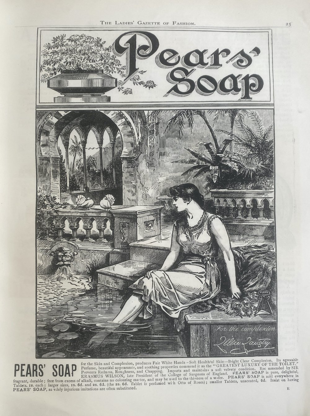
Advertisements about soap were found in almost every periodical at the time and were quite extravagant. The pretextual information provided by this advert for soap depicts a luxurious scene and a fair woman; solidifying their marketing for their soap providing “Fair White Hands - Soft Healthful Skin - Bright Clear Complexion”. The luxurious image of this advert implies that the product is intended for middle to upper classes.
The advert declares that one should use Pears to achieve “the complexion Lillie Laughty”. Lillie Laughty (1853-1929) was a socialite, stage actress, producer, and the mistress of the Prince of Wales, later Edward VII. She is said to have been one of the most celebrated beauties of her age. This is almost, to use a phrase of today, a celebrity endorsement.
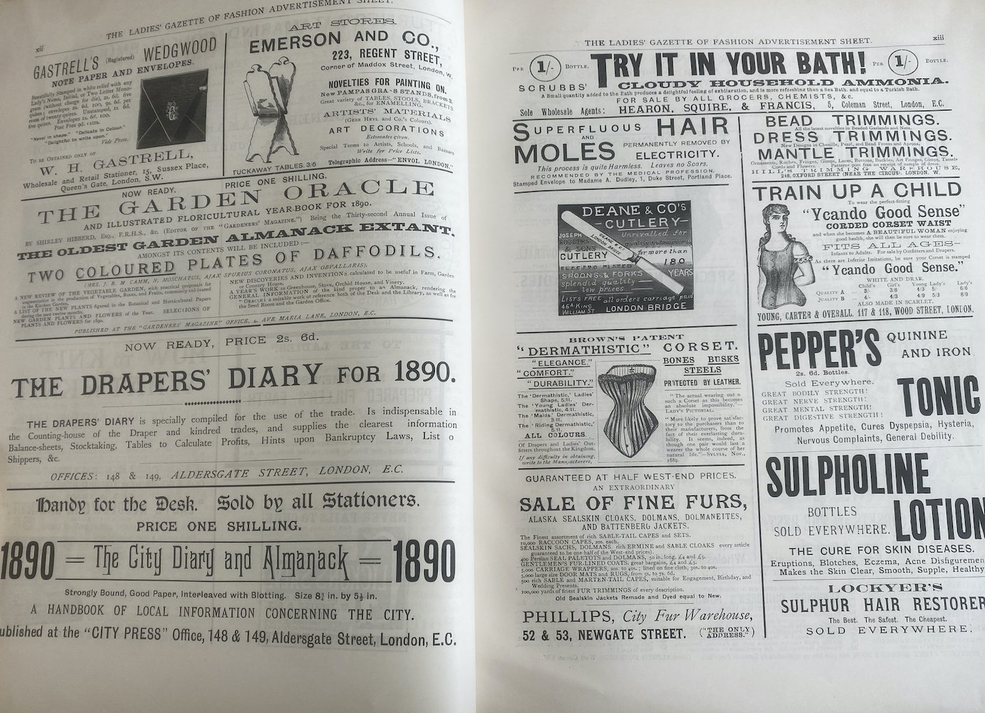
This page spread of adverts shows a widespread variety of products. There are more adverts on this page spread compared to the previous periodical in 1885, presenting a more competitive market. These adverts are predominantly written, using typography to make them eye-catching and stand out compared to the soap advert that had the privilege of a whole page to use illustrations to make the reader drawn to it. The larger the advert, the bigger the cost to the producer of the product, the smaller advertisements are cheaper, which shows that Pears is a very successful brand compared to those in the crowded advertisement space.
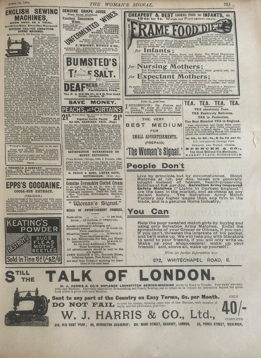
1894 - The Woman’s Signal
The number and variety of products on this page in the periodical is vast and expansive and shows the difference in periodical The Woman’s Signal was to the Ladie’s Gazette of Fashion. This periodical was for promoting women and feminism and these adverts reflect that and the periodicals audience.
The adverts are still aimed towards women such as the adverts for the sewing machine, “Frame Food” Diet and Peach’s Lace Curtains.
Some of the adverts also reflect the political aspect of the periodical which would have been engaging for the reader of the paper, for example, the advert about matches making “people don’t” and “you can” in bold to present the idea that getting this product is going towards making a large difference; more eye-catching to the reader than a illustration would’ve been.
1896 - The Woman’s Signal
The two opposing advertisements about cocoa are on the same page in the periodical and present similar marketing tactics - using the brand name to influence the readers into buying the product.
However, there are differences within the adverts. The Cadbury’s advert uses the space to make the logo visually appealing as well as using any spare space to make the product sound appealing to any consumer.
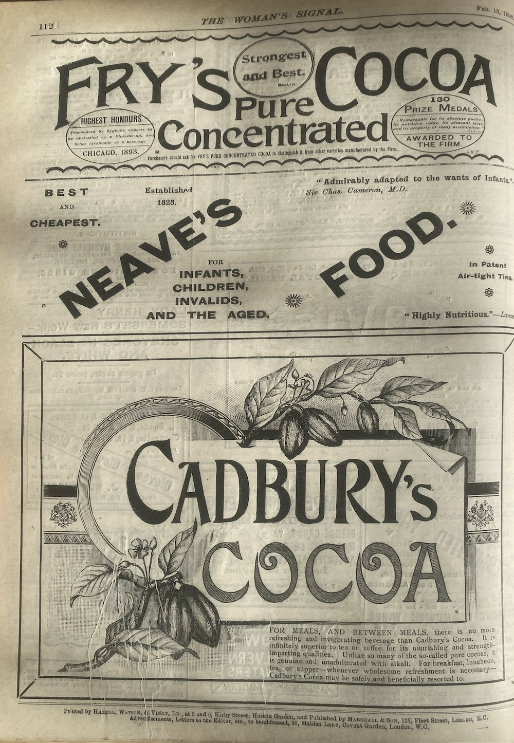
Compared to this, Fry's Cocoa uses the majority of the space for the brand name and the awards given to the firm, with less of an approach to engage consumers as it is telling the reader information instead of marketing it to the reader specifically.
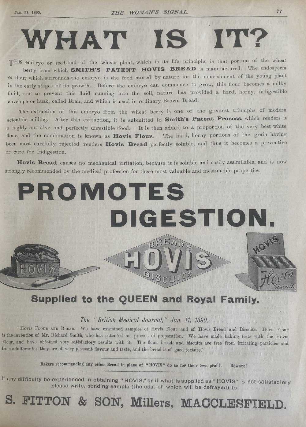
Hovis Bread advertisements
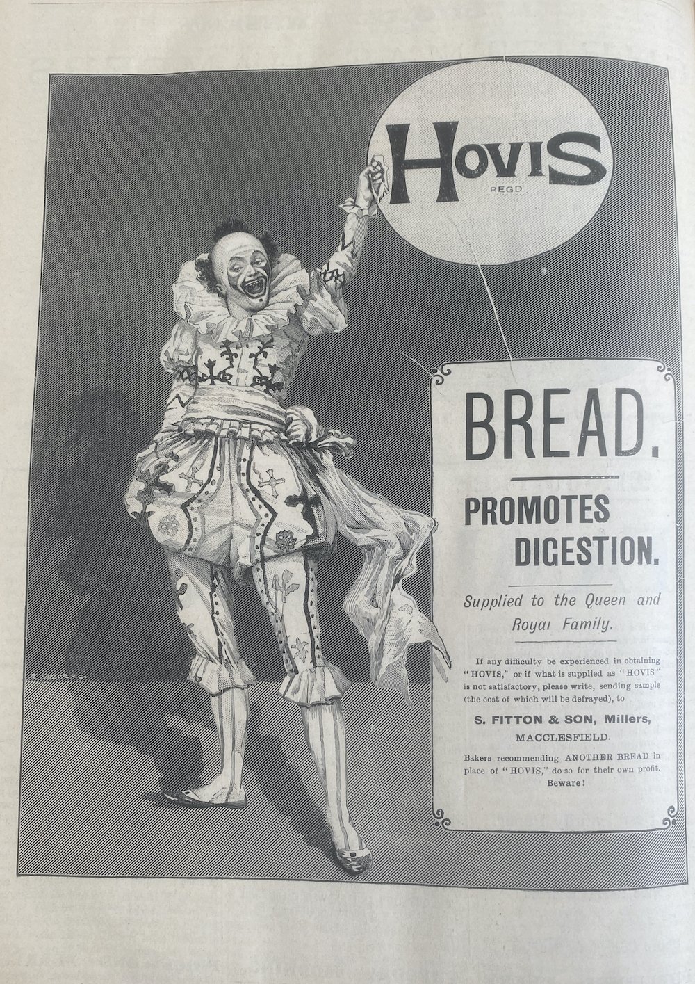
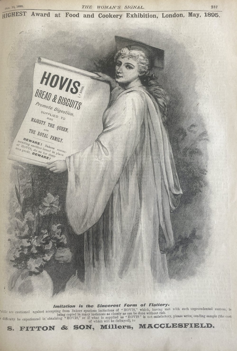
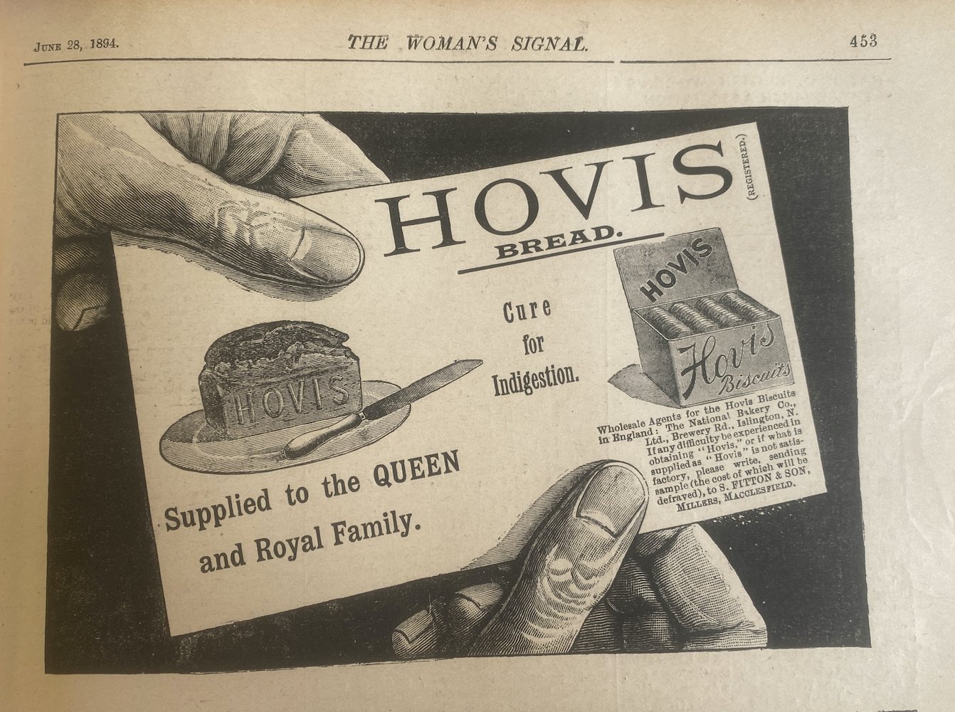
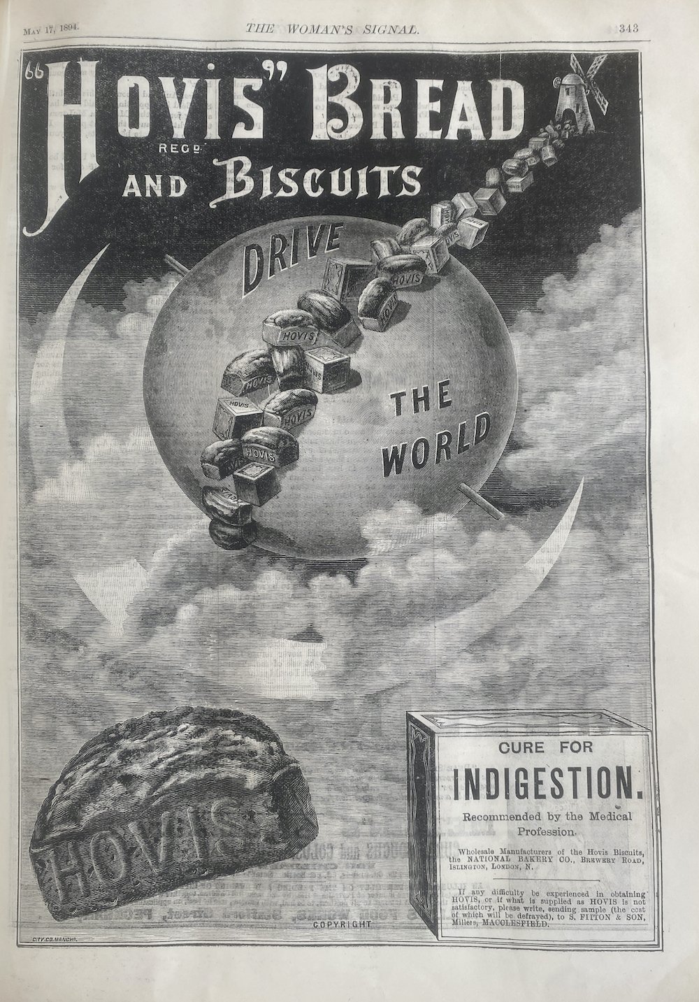
These Hovis Bread advertisements are taken from periodicals across the 1890’s. The advertisements focused on promoting the healthiness, the easy to digest and nutritious side of the product instead of the bread itself. The Victorian’s were concerned with public health, which can be seen through the many adverts for cod liver pills and medicines in periodicals, which is reflected through all of Hovis Bread advertisements.
The adverts typically had a whole page in periodicals and would be illustrating scenes or characters with the logo, this blended nostalgia with process: the bread was portrayed as rooted in traditional nourishment while benefiting from new industrial techniques. These were published in late decade of the Victorian era and the marketers of this time used the ever expanding print culture to construct trust, promote nutritional claims and position the branded bread as a strong solution to the contemporary health debates.